History of the Powell Peralta Top Logo
( or "Gaying off with the Bones Brigade" or "How I spent my 2002 Labor Day" )
by S.Cliver
|

|
|
Okay, so I fully acknowledge that this is without a doubt the gayest thing I've ever done in my lifetime, but for some odd reason it pains me to see people buying and selling decks on eBay that are nowhere near their true year of origin. This, of course, should not bother me--there are far bigger things in the world to piss and moan about--but if we're all going to be assessing these ridiculous values to planks of decorated wood, then by all means they should have some historic basis to be rated on. Or, as Morrisey may have put it, "Some McGill 'Skull and Snake' decks are older than other McGill 'Skull and Snake' decks." But it's not surprising that many are confused on this topic due to Powell's erratic method of copyrighting graphics. Now by no means am I claiming to be an expert, but having lived and breathed a small chunk of this puzzling history I'll do my best to recall a few trivial details that should've been flushed from my memory long ago. If anyone can add to these historical facts, especially from the late 70s, feel free to contact AoS. For all I care treat it like a Linux OS, a line of code to be improved upon by community participation. But it had to start somewhere, so here it is.
|

|
| 1978-1979 |
 |
| To be honest, I'm a bit fuzzy on this particular time
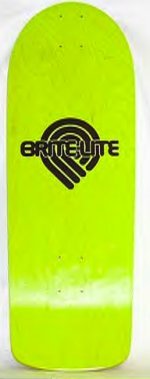
period, but for all intents and purposes, the first top logo to really
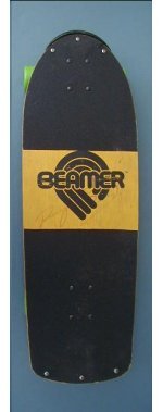
matter in terms of the popular "graphic" boards is the Powell "bug,"
a/k/a "Triple-P" logo from the late 70s. Came in two forms, I think,
one with just "Powell" in the center of the logo, the other reading
"Brite-Lite." Note: Early production runs of Alan Gelfand's "Ollie/Tank"
pro model do exist with the "Powell" top logo and, consequently, should
be valued accordingly. |

|

|

|
|

|
|
|

|
| 1980-1985 |
 |
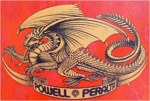
Around 1980, or as near as I can tell, Powell's top graphic switched to the classic two-color dragon and banner emblem. Typical colors for this logo were blue, golden yellow, red and metallic gold. This top logo does not bear a "TM" or any copyright info beneath the banner. |
|

|

|
| 1985-1986 |
 |
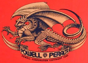
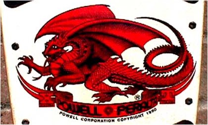
Towards the end of 1985 or early 1986, a second version of the dragon replaced the previous top logo and is differentiated by a greater amount of detail in the dragon's wings and a slimmed down tail, along with new copyright info, which reads, "Powell Corporation Copyright 1980."
|
|
 |

|
| late 1986 |
 |
In the fall of 1986, Powell introduced a new
concave without wheel wells, along with new shapes and graphic makeovers for Caballero, McGill, Hawk
and Mountain. Deck colors at this time were red, navy blue, black, white,
silver, cyan and hot pink. |
|
*please send us an image!*
|

|
| 1987 |
 |
Powell went out and shot themselves in the foot by introducing "Boneite," a
fancy material that was actually water-absorbent tar paper. The first decks
to hit the market were actually billed as "lighter," too, because in
addition to four layers of hard-rock maple and four layers of tar paper,
there were two thick layers of "soft-rock" poplar sandwiched in the middle.
(Next to the Santa Cruz foam decks, this was probably the worst construction
ever, because the edges of the boards mushroomed with any slight impact.)
These decks did not bear any change in top logo, and, if I'm not mistaken,
the Welinder street model was first introduced to market with this
construction. (Apparently, there are some Ripper pigs that were produced in
this first Boneite construction as well.) By mid 1987, Powell sort of
realized the mistake but still went on to "re-introduce" Boneite, albeit
with the "XT" initials added to the left and right of the banner on the
dragon top logo. While the decks may not have been "Extra Tough," they were
definitely extra heavy.
|
|
*please send us a side view image of boneite
layers!* |

|
|
By mid 1987, Powell sort of
realized the mistake but still went on to "re-introduce" Boneite, albeit
with the "XT" initials added to the left and right of the banner on the
dragon top logo. While the decks may not have been "Extra Tough," they were
definitely extra heavy.
|
|

|

|
| 1988 |
 |
Sometime early on in the year, Caballero's "Dragon and Bats" was released in
full, mini and street sizes, along with the Skull and Sword/Ripper
uni-shape. The third graphic to grace this shape--and the consequent scourge
of eBay--would soon follow, the "Bug" deck w/ checkerboard background. Not
until the late summer of 1988 did Powell finally admit defeat and return to
an all maple 7-ply construction. (Well, they offered both models at first,
but no one really wanted anything to do with Boneite ever again.) With the
introduction of these boards came a new spoon-nose concave, new shapes on
McGill, Guerrero and Mountain (the Vallely deck would soon follow), and a
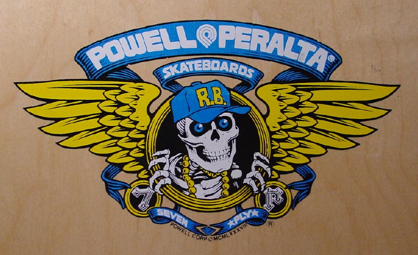
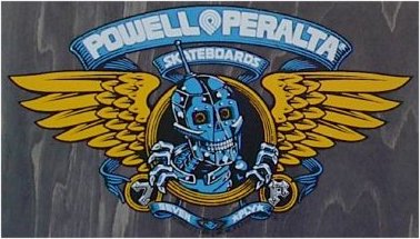
new two-color top logo, the "Winged Ripper," in red, blue or metallic gold.
Note: there are two versions of the "Winged Ripper," one with the initials
"XT" and the other "7P". Two new deck colors were also introduced at this
time, lime green and yellow, as well as a new shape and ant background for
the "Bug" team/generic deck. The mysterious "Butterfly" team/generic deck
that appears on a Powell Peralta product poster from this time period was
never produced, but prototypes do indeed exist (incidentally, this was not a
VCJ graphic, but a Chris Buchinsky design).
|
|


|

|
| early 1989-1990 |
 |
In early 1989, the Hawk "Skull and Iron Cross" was retired and replaced by the "Claw" graphic with the standard two color "Winged Ripper" top logo. With the Hawk street model--the black deck with a small hawk-like emblem in upper left of deck--Powell switched to a slick 4-color top logo with either a red or blue banner. (Later on, the "Winged Ripper" would be personalized to each individual board graphic and continue like that through the rest of 1990.) In terms of deck construction, Powell plodded into the year with a spoon nose concave, but somewhat got with the times by releasing a mild kicknose in late spring. (What happened to the HUGE excess back stock of XT and spoon nose decks? They were shipped to the Powell division in China--Powell Golden Dragon--and, thanks to deck collectors, many of these decks have since completed their round trip journey from the Far East.) This model was soon replaced by a steeper degree of kicknose and concave on stained veneer boards in the fall. Consequently, there are a few boards, like the Barbee I, Saiz I, Caballero with the giant Oriental dragon head and neck, and a few others that had production runs in all three molds. And for the really hardcore collector, the Barbee "Ragdoll I" was first released in the yellow/red/green rasta color scheme, then the grey one, and finally the aqua blue/yellow/red.
|
|


|

|
|
Note: All those McGill "Skull and Snake" graphics printed on a stained veneer--sans the snake-print background--with kicknose came out in late 1989 before the graphic was finally retired (up until the anniversary re-issues, that is).
|

|
| early 1991 |
 |
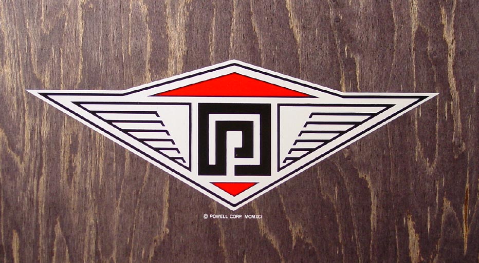
Briefly in early 1991, a new top logo was introduced, a stylized black white and red winged looking thing, but it didn't last more than half the year. In the latter part, all decks were treated with individual top graphics tied into the bottom graphic. Note: Chris Senn's first pro model doesn't even mention the company name on the top logo!
|
|


|

|
| post 1991-Present |
 |
After 1991, I no longer cared what happened to or on a Powell Corp. board because they laid my ass off, but anyone else is invited to pick up the historical torch and run with it if they so desire.
|

|
|
( AoS would like to thank Mr.Cliver for taking the time to write such a fine article and share this information
with our visitors. If you have additional information to add to this article, as Mr.Cliver has asked, please
send it to us to add to this evolving document! )
|
